Project name: SAS – Check in kiosk redesign
Responsibilities: UX research, UI & Interaction design
Duration: January 2014 – May 2014
Overview
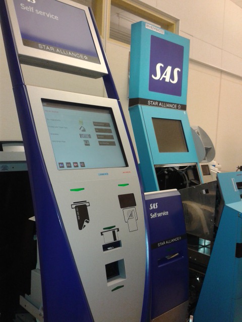
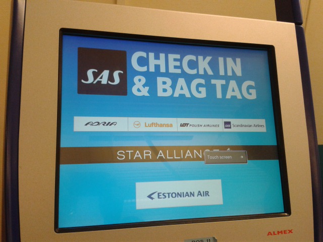
Back in 2014, the software that ran in the self service kiosks at airports for check-in with SAS, was the same since the day the kiosks were installed many years before. The check-in flow and UI for the kiosks at the airports were old and outdated.
My task was to redesign the UI of the check-in kiosks in order to sync it with the current SAS Digital identity but also redesign the flows to accommodate for upcoming features.
This was a challenging project which was heavy on user task analysis. However, this was such a relatable problem I was asked to solve: think of the last time you tried to check in for your flight at a self service kiosk with 10 people lining up behind you wishing you would hurry up, while you try to find your booking reference number with 2 bags in your hands and a crying child next to you! My goal was to make this task as easy, fast and straightforward as possible for the stressed traveler.
This project in keywords:
UX management, User scenarios, User requirements analysis, Stakeholder requirements analysis, Wireframing, UI design, Visual design, User evaluation, Cognitive walkthrough, Paper prototyping, Photoshop, Axure
What I did:
In this project I led the UX & UI redesign and also drove the communication between the internal business stakeholder and system tech experts and the external SW engineer.
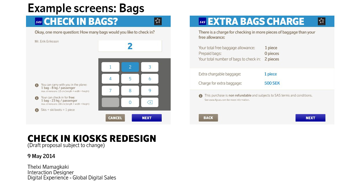
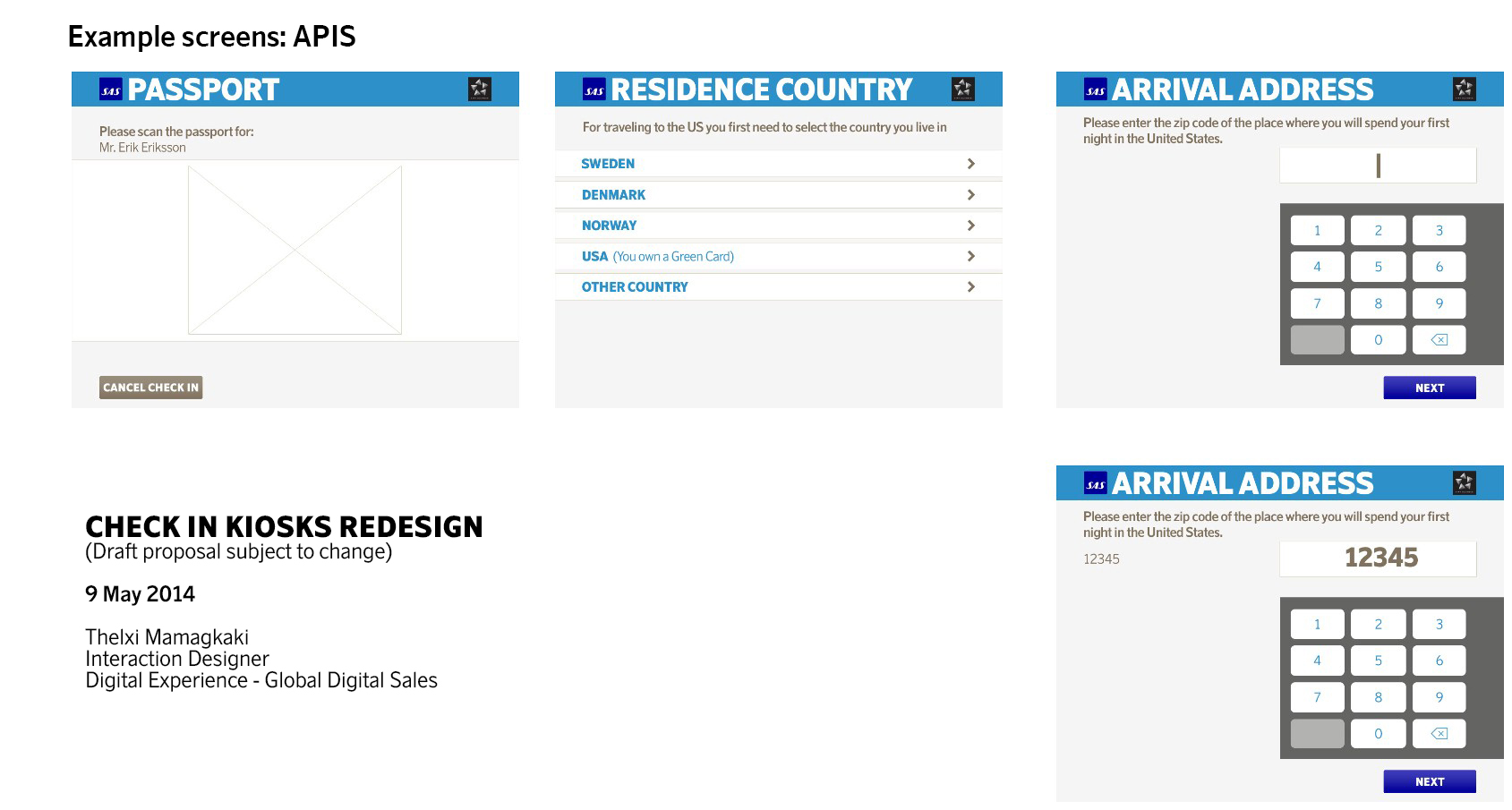
My main job was to redesign the UI of the SAS self service check-in kiosks to cater for a better UX and give it a new, refreshed SAS look. Moreover I had to design the flows for the new features that will come in the future to offer ancillary services and payment.
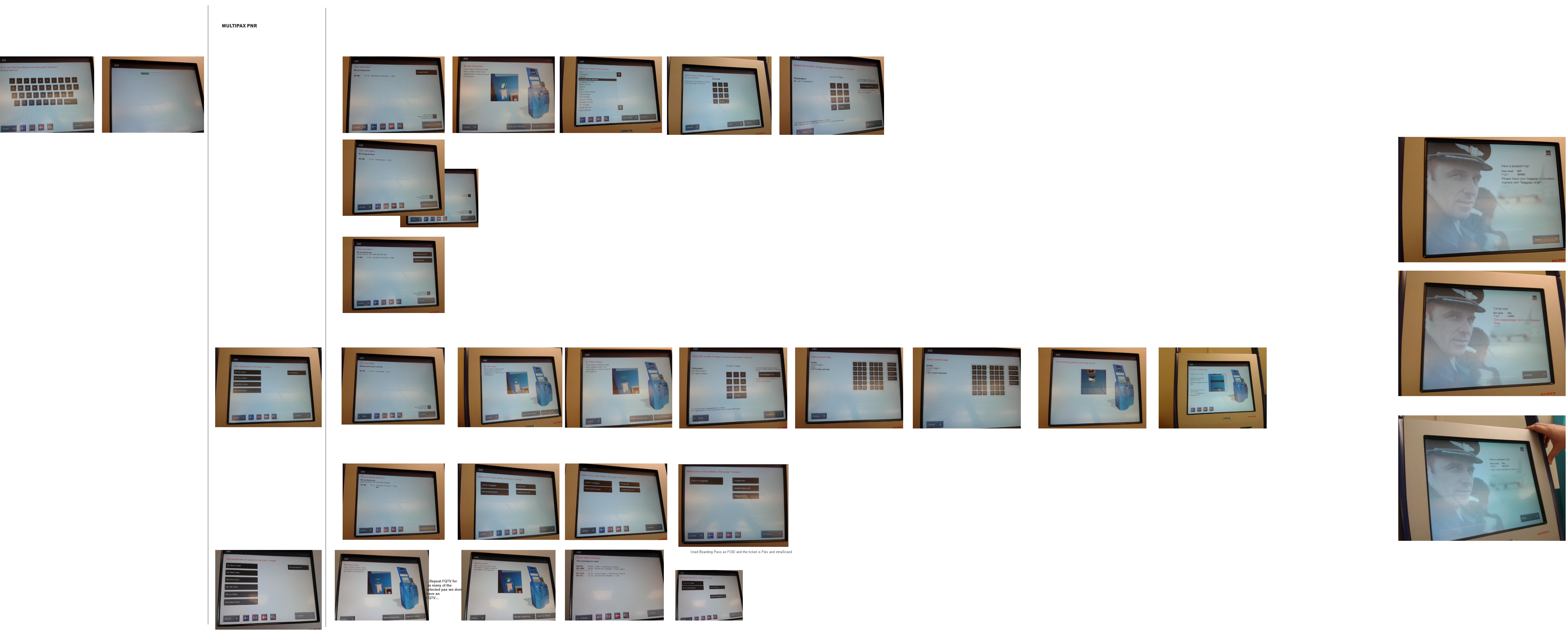
I started by testing out and analysing the existing check-in flow at the kiosks and mapping out all the different use scenarios and setting down the user requirements. In parallel I gathered all the business requirements from the internal stakeholder and the two tech leads to keep in mind all the technical limitations that are present in the check – in systems.
Then I started restructuring the flow in a more straight forward way, trying to remove any unnecessary flow steps. Based on that initial structure, I redesigned the UI and tested the new flow and UI with paper prototypes. The user feedback from that phase resulted to a reiteration of the UI. Detailed visual design was required in that point, due to the screen limitations of the check-in kiosks. These touch screens are mostly old and not very accurate, therefore it was a challenge to design a clean yet content-rich interface with big touch elements in an already limited pixel real-estate.
This redesign was launched in 2015 in all self service check-in kiosks at airports within the Star Alliance network.